11.30.2010
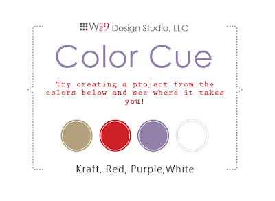
...{...Color Cue {10} Challenge...}...
I thought this challenge would be much easier for me as I LOVE red/purple color combo during the winter months. And yet, I struggled. I think it is because I'm not overly fond of Paptertrey Ink's Plum Pudding color, which is the cardstock I used. Don't get me wrong, I LOVE most everything Papertrey Ink, but I do wish they had a broader color selection. Like I would love a richer, darker purple! And OH, if they had a wonderful LIGHT GRAY, that would be HEAVENLY (I'm looking for the perfect shade of light gray cardstock)...oh my, I digress... Once I finished the card, I was much happier than when I started laying it all out. I think I've been trying to go w/ more simplified versions lately, and I am a girl who LOVES details and all the extra goodies. For me, once I put the buttons on the card, I was smiling ;-)
...{...how i made this...}...
• paper
papertrey ink - cardstock - plum pudding
anna griffin - sierra (backside is kraft)
k & company - paper doll
• stamps and ink
inkadinkado - aritistic holiday stamp set
ranger - embossing tinsel - red
versamark - watermark pad
tattered angels - glimmer mist - oriental poppy
papertrey ink - fresh snow
marvy white pen
• adhesives
paper studio - sticky dots
scrapbook adhesives - ez dots
tombo mono - aqua liquid glue
• tools
fiskars - paper trimmer
martha stewart - score board, paper punch
we r memory keepers - crop-a-dile corner chomper
ek success - cutter bee scissors
Subscribe to:
Post Comments (Atom)
thanks for stopping by!!!
my story

- jessica - craftychicgirl
- child of God // daughter, grand-daughter, aunt, niece // lover of most anything Jane Austen related or period-piece // dark chocolate addict // collector of shoes, clothes and accessories // art director // painter // paper crafter //


Super sweet! LOVE all your heavenly details! Thanks for playing along with the Color Cue!
ReplyDeleteThanks...I enjoy the color challenges!
ReplyDelete