8.21.2012
layout redesgin
yay, i've got some blog posts ready to go this week.
last week i pulled out my scrapbooking supplies and got quite a few layouts made. it felt good to dig back in to some creativity.
the first thing i wanted to do was redo this layout above. when i created it i was playing around with a simplistic approach. i just wanted a stamped background and not much else because i felt the collage of pictures was busy enough. but i knew as soon as i created the layout that i did not like it...at all! however i just didn't have any other ideas for it at the time. this time however i knew exactly what i wanted to do for a redesign.
i started by stripping off the college of images. they were all taped together pretty good so i couldn't do much about that. i did add a couple more pics to change the size a bit.
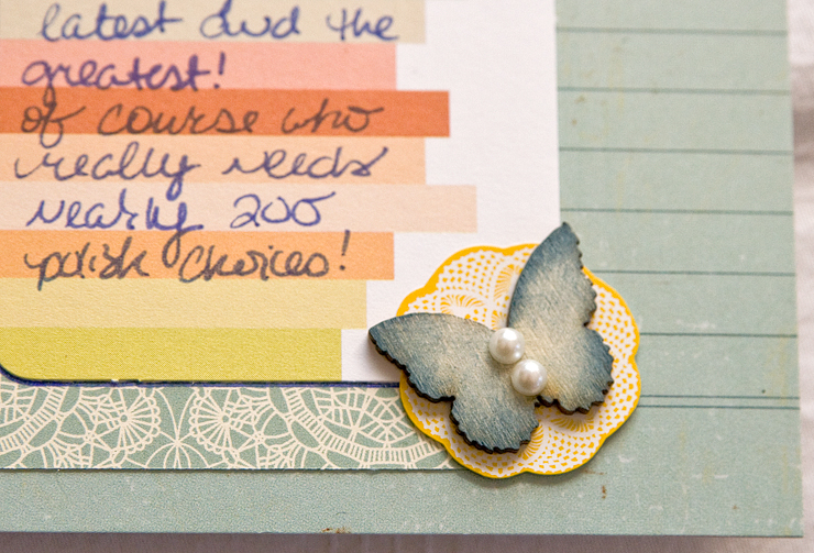
after adhering the pics to white cardstock i wanted to anchor down the other side of the layout so i added a strip of paper and began adding embellishments accordingly.
before i added the title though i felt that the white cardstock was a bit too stark between the dark pics and the muted blue paper section on the other side. so i thought a bit of watercolor might be nice.
at this point i was a bit nervous about trying to do some watercolor since i was nearly done w/ this layout and it was already the 2nd time i'm dealt w/ these pics. so i grabbed a piece of extra cardstock and tried out a few techniques first. i love the finished look that came out.
i took a watercolor 'pen style' paintbrush that houses water in it and dipped it into a mister huey in the color watercooler. the first brush strokes were a bit too strong in color so i'd swipe the brush across the extra paper until it was the opacity i desired then i'd brush the color onto the layout. it did warp the paper a bit, but i just used a heat gun and it doesn't look too bad.
i'm not sure i'd ever do this again to a layout, but i definitely am happy with the redesign of this one!
~ jess
Subscribe to:
Post Comments (Atom)
thanks for stopping by!!!
my story

- jessica - craftychicgirl
- child of God // daughter, grand-daughter, aunt, niece // lover of most anything Jane Austen related or period-piece // dark chocolate addict // collector of shoes, clothes and accessories // art director // painter // paper crafter //


it looks great the color on the white cardstock really makes the pictures pop.
ReplyDeleteI love your redesign! It turned out fabulous. I love the watercolor, I am going to gave to try that.
ReplyDeletevery cute, i've had a couple layouts that i had to rip apart and start over, yours turned out very well :)
ReplyDeletei love all of your nail polish colors too! i can't seem to keep nail polish on my nails for more than an hour without it chipping off so i almost never wear it :)
I do this too sometimes. Love the re-make!
ReplyDeleteI like both layouts, but I think I prefer the second more because of all the gorgeous embellishments you used!! The watercolor looks great! I just noticed on SC you live in Arkansas! Me too! :)
ReplyDeleteLOve the remake!
ReplyDelete